The popular idea that the economic divide between Australia’s cities and regions is getting bigger is a misconception. Beneath the oft-told ‘tale of two Australias’ is a more nuanced story.
Each of the links below will open an interactive map which will allow you to review the data. Note that each map is approximately 16 Mb and it is not recommended to open on devices using mobile data.
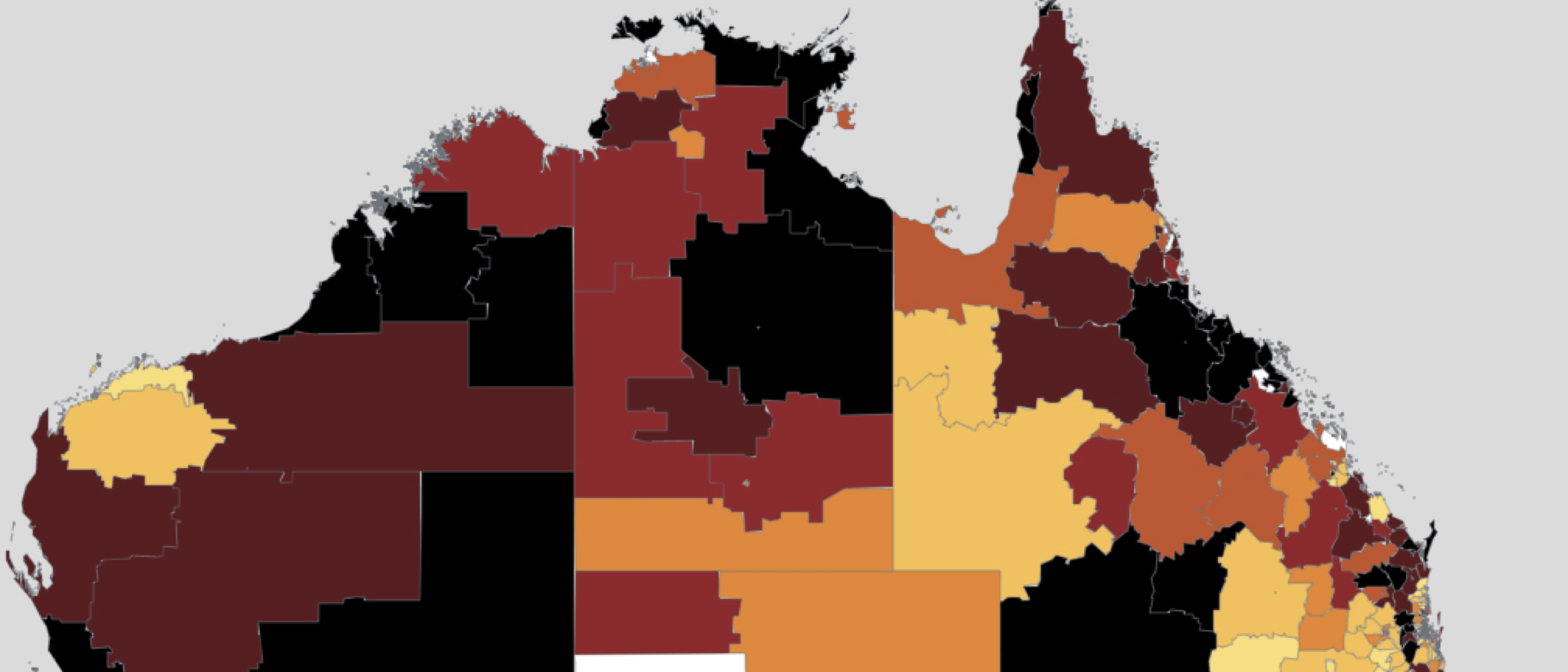
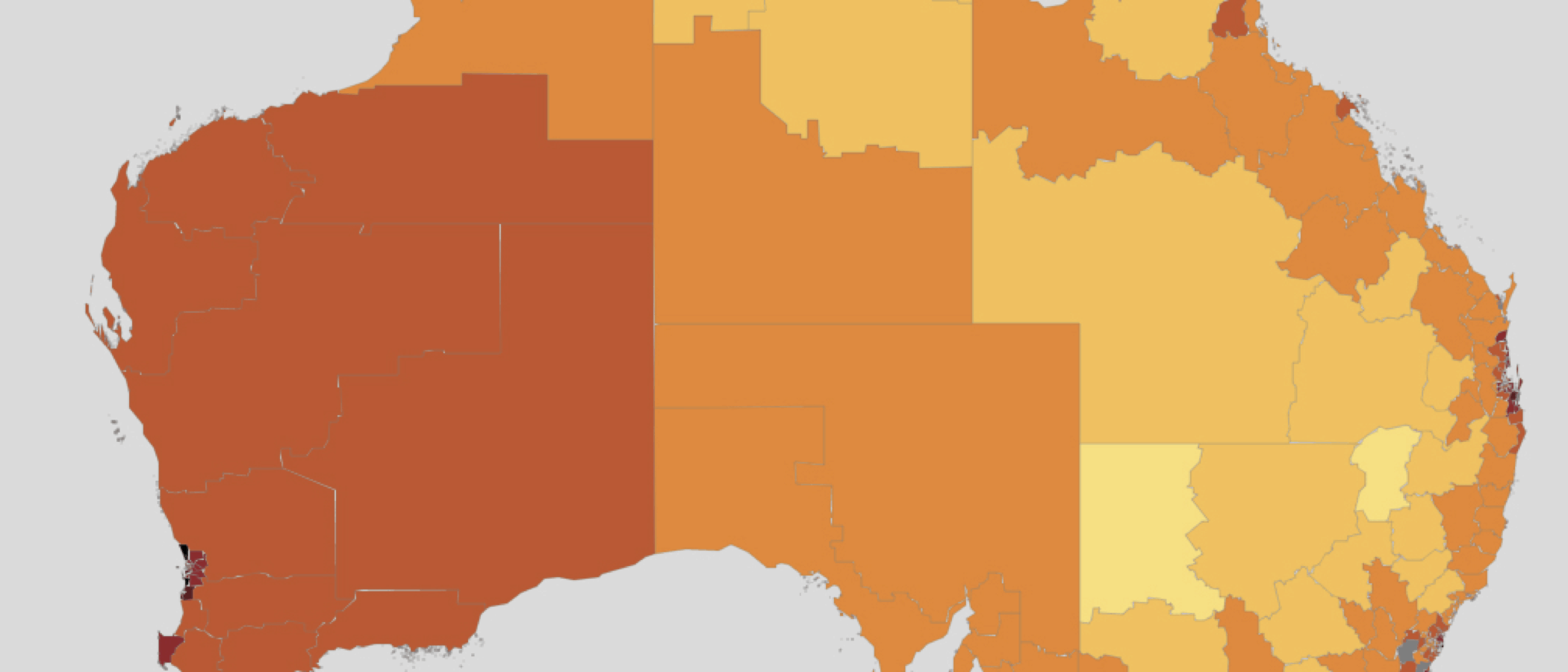
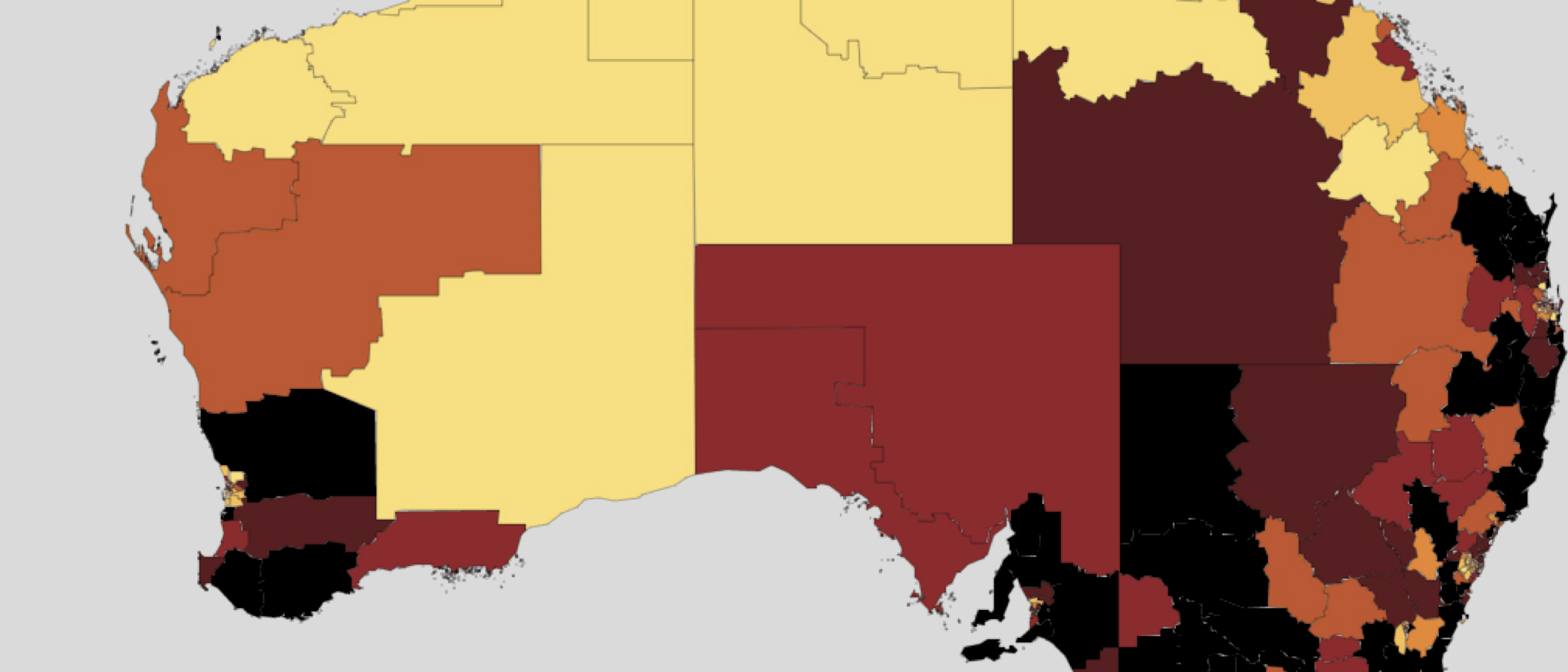
People in mining areas and the cities have higher average incomes
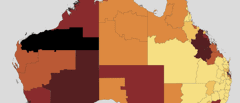
Units/Description: Average taxable income per taxfiler 2014-15
Map is coloured by ABS Statistical Area Level 3s (SA3s), and grouped into population-weighted septiles. The outer suburbs of Brisbane have been excluded to aid readability.
Notes: See Appendix A of Regional Patterns paper for a discussion of map methodology
Source: ATO (2017) Taxation Statistics 2014-15, Individuals, Table 8; Grattan analysis
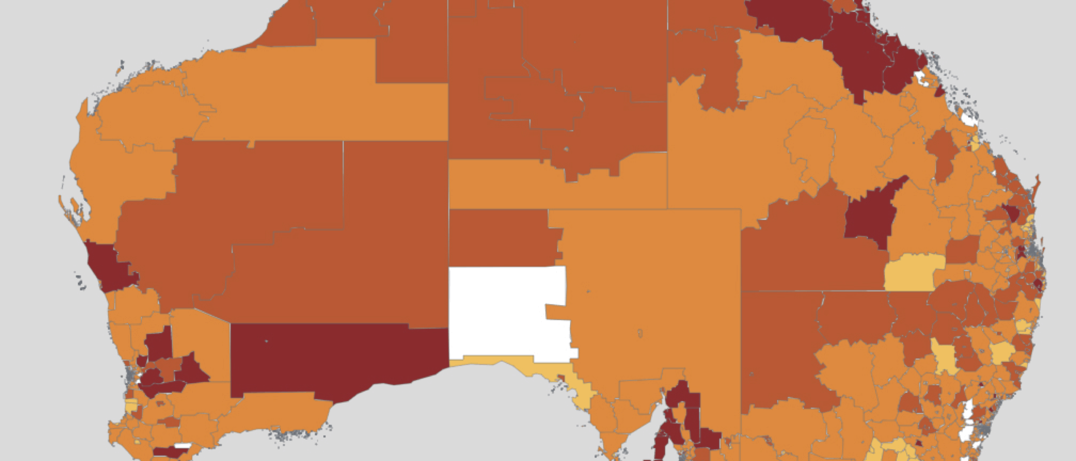
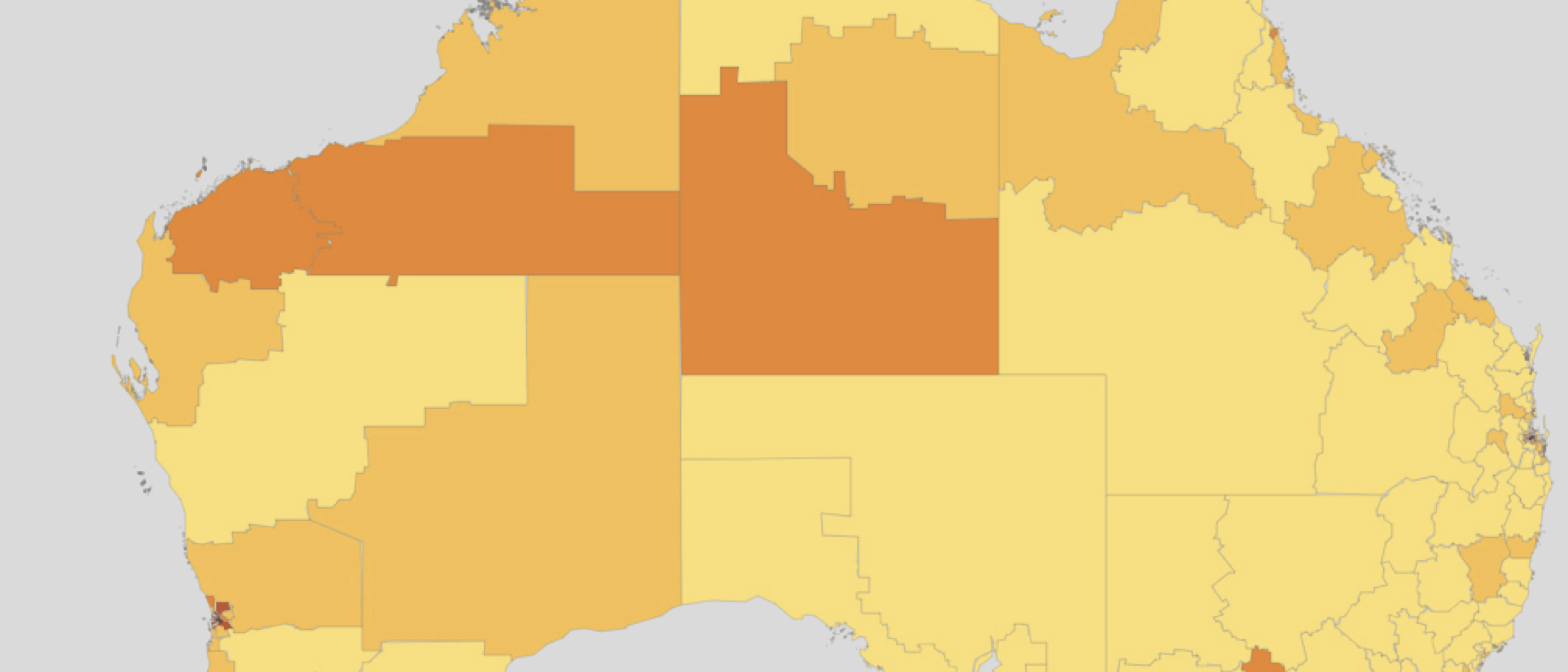
Cities and regions have areas of high income growth
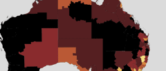
Units/Description: Average annual growth, real taxable income per taxfiler 2003-04 to 2014-15
Notes: The growth rate is calculated as the CAGR in income per tax filer 2003-04 to 2014-15. Map is coloured by ABS SA3s, and grouped into population-weighted septiles. The outer suburbs of Brisbane have been excluded to aid readability. See Appendix A of Regional Patterns paper for a discussion of map methodology. This map has been updated from the original release of this report.
Source: ATO (2017) Taxation Statistics 2014-15, Individuals, Table 8; Grattan analysis
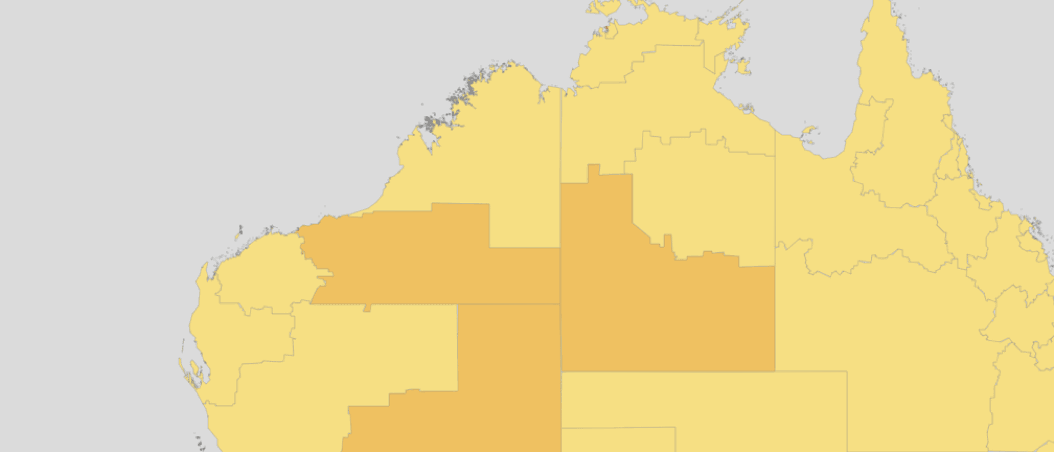
Areas with high incomes tend to be the most unequal
Units/Description: Income inequality proxy, mean/median income, 2014-15
Notes: Map is coloured by ABS SA3s, and grouped into population-weighted septiles. The outer suburbs of Brisbane have been excluded to aid readability. See Appendix A of Regional Patterns paper for a discussion of map methodology.
Source: ATO (2017) Taxation Statistics 2014-15, Individuals, Table 8; Grattan analysis
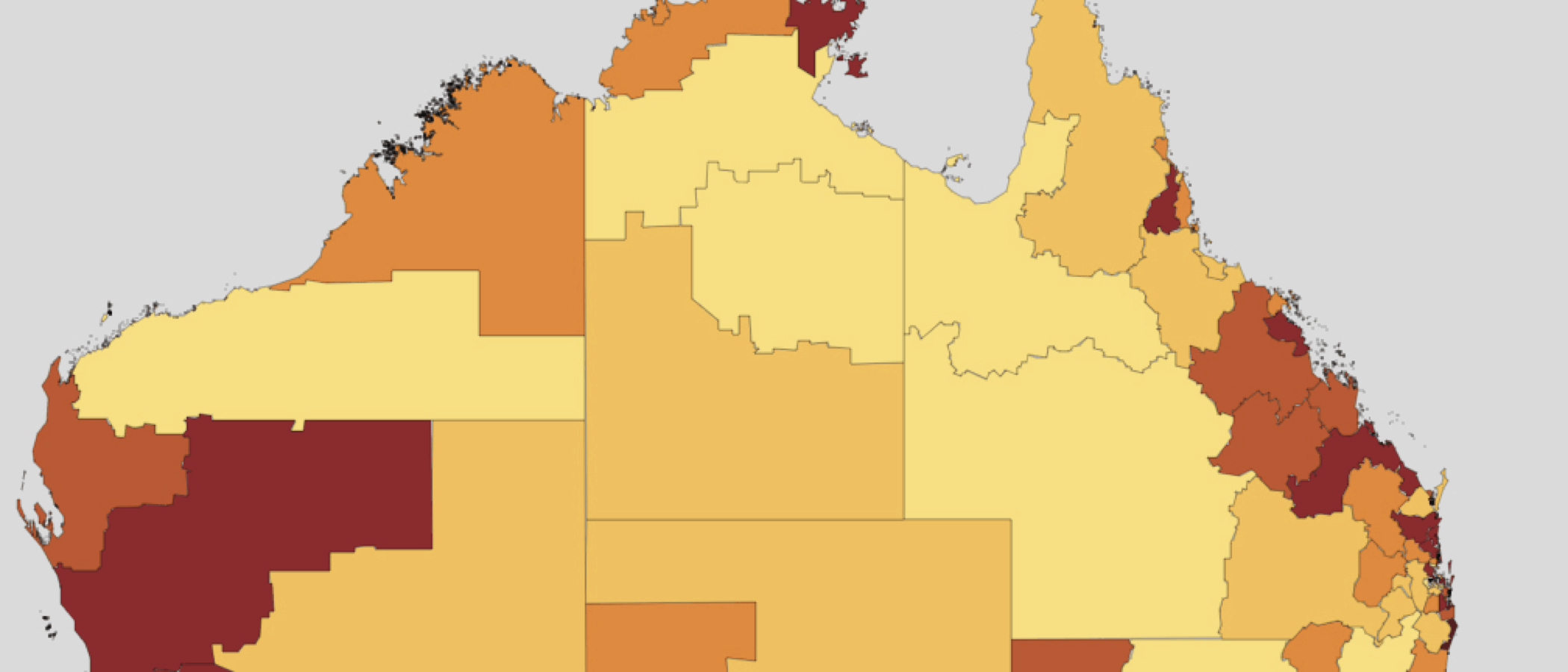
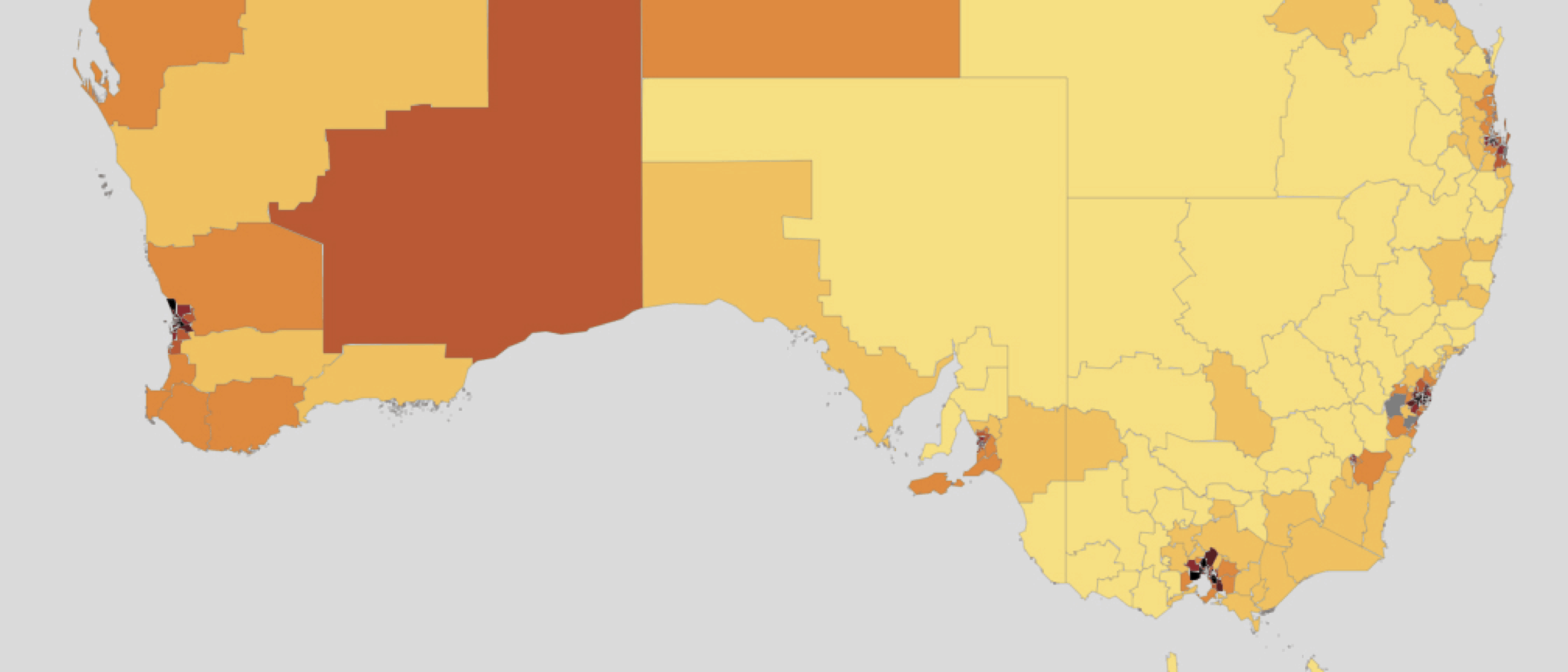
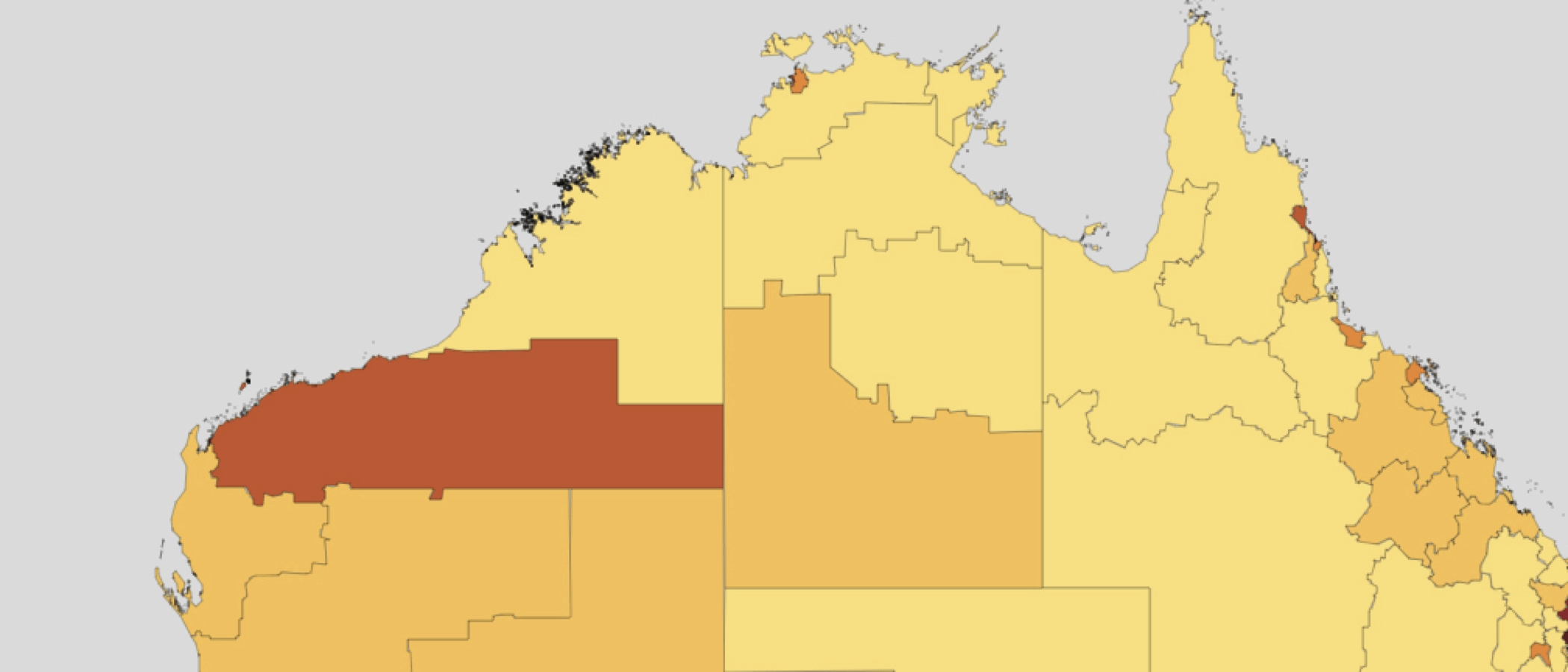
Both cities and regions have pockets of high unemployment
Units/Description: Unemploymnet rate, average for 2016 (%)
Notes: Map is coloured by ABS SA2s, and grouped into population-weighted septiles. The outer suburbs of Brisbane have been excluded to aid readability. See Appendix A of Regional Patterns paper for a discussion of map methodology
Source: Department of Employment (2017a) SA2 Data tables – Small Area Labour Markets – March quarter 2017; Grattan analysis.
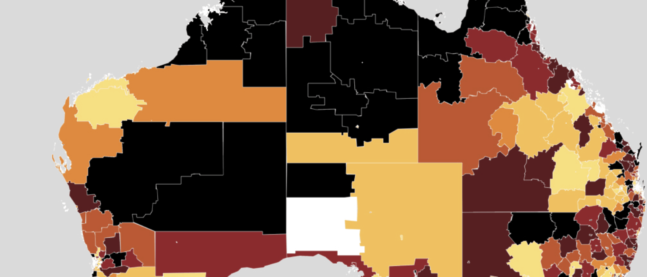
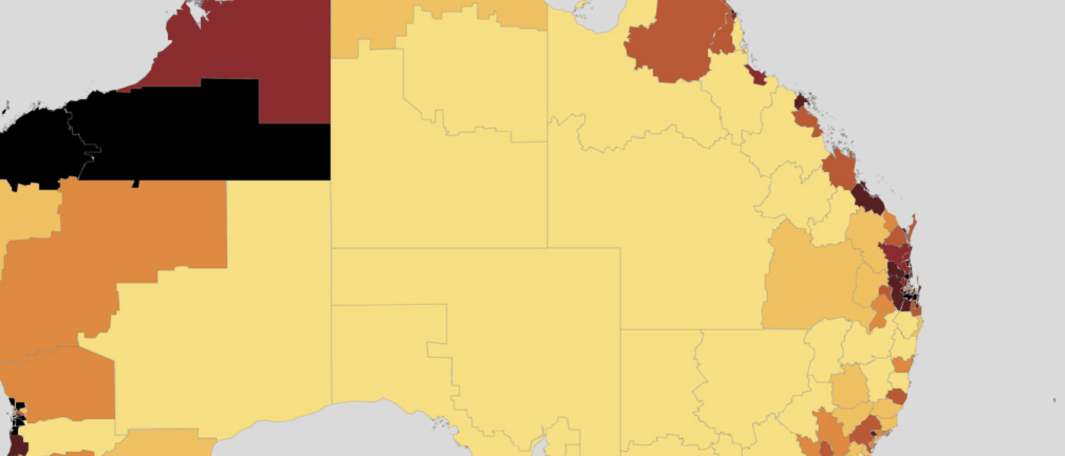
Unemployment is not increasing more rapidly in the regions
Units/Description: Change in unemployment rate, percentage point change 2011 to 2016
Notes: Map is coloured by ABS SA2s, and grouped into population-weighted septiles. The outer suburbs of Brisbane have been excluded to aid readability. See Appendix A of Regional Patterns paper for a discussion of map methodology
Source: Department of Employment (2017b) Small Area Labour Markets publication – Explanatory Notes; Grattan analysis.
Unemployment in some regional areas and city suburbs has got worse since 2011
Units/Description: Unemployment rate comparison
Notes: Map is coloured by ABS SA2s. Regions are categorised by the change relative to average unemployment in 2011 and 2016. Regions that are “Pulling ahead” had above averageunemployment rates in 2011 and below average unemployment rates in 2016. Regions that are “Staying ahead” or “Staying behind” have always had below or above average unemploymentrates, respectively. Areas that are “Falling behind” had below average unemployment rates in 2011, and above average unemployment rates in 2016. See Appendix A for a discussion ofmap methodology
Source: Department of Employment (2017a) SA2 Data tables – Small Area Labour Markets – March quarter 2017; Grattan analysis.
Australia’s population is concentrated in the major cities and surrounding suburbs

Units/Description: Population density, percentage of the total population by density, 2016
Notes: Map is coloured by ABS SA3s density: 80 per cent of the population lives in the most dense, red areas; a further 10 per cent lives in the next most dense, dark orange areas; another 8 per cent lives in the less dense, orange areas; and the remaining 2 per cent of the population lives in the least-dense, yellow areas.
Source: ABS 2017 Census of Population and Housing, 2016, Australian Bureau of Statistics
Population growth is highest in capitals, the regions around them, mining areas, and along the coast
Units/Description: Population growth 2006 to 2016 (%)
Notes: The growth rate is calculated as the CAGR in population 2006 to 2016. Map is coloured by ABS SA3s, and grouped into population-weighted septiles. See Appendix A of Regional Patterns paper for a discussion of map methodology.
Source: ABS 2017 Census of Population and Housing, 2016, Australian Bureau of Statistics
Immigrants tend to settle in the cities and the mining areas
Units/Description: Percentage of the population born overseas, 2016
Notes: Map is coloured by ABS SA3s, and grouped into population-weighted septiles. The outer suburbs of Brisbane have been excluded to aid readability. See Appendix A of the Regional Patterns paper for a discussion of map methodology
Source: ABS 2017 Census of Population and Housing, 2016, Australian Bureau of Statistics
Europeans and English-speaking immigrants move to regional areas as well as cities
Units/Description: Percentage of the population born in English-speaking or European countries, 2016
Notes: Map is coloured by ABS SA3s. See Appendix A of Regional Patterns paper for a discussion of map methodology
Source: ABS 2017 Census of Population and Housing, 2016, Australian Bureau of Statistics
Asian communities are very concentrated in some capital city suburbs
Units/Description: Percentage of the population born in Asia, 2016
Notes: Map is coloured by ABS SA3s. See Appendix A of Regional Patterns paper for a discussion of map methodology
Source: ABS 2017 Census of Population and Housing, 2016, Australian Bureau of Statistics
People born in Africa and the Middle East are concentrated in a small number of capital city suburbs
Units/Description: Percentage of the population born in Africa or the Middle-East, 2016
Notes: Map is coloured by ABS SA3s. See Appendix A of Regional Patterns paper for a discussion of map methodology
Source: ABS 2017 Census of Population and Housing, 2016, Australian Bureau of Statistics
Cities have a higher proportion of tertiary educated people
Units/Description: Percentage of the adult population with tertiary education, 2011
Notes: Percentage of the population over 15 with tertiary education. Map is coloured by ABS SA3s, and grouped into population-weighted septiles. The outer suburbs of Brisbane have been excluded to aid readability. See Appendix A of Regional Patterns paper for a discussion of map methodology
Source: ABS 2017 Census of Population and Housing, 2016, Australian Bureau of Statistics
Regional NSW and regional Victoria have older populations than the rest of the country
Units/Description: Median age, 2016
Notes: Map is coloured by ABS SA3s, and grouped into population-weighted septiles. The outer suburbs of Brisbane have been excluded to aid readability. See Appendix A of Regional Patterns paper for a discussion of map methodology.
Source: ABS 2017 Census of Population and Housing, 2016, Australian Bureau of Statistics